Color is the first thing people notice about your brand. Before they read a single word, it has already shaped how they feel. That is why color psychology in branding matters so much for startups. When you choose colors on purpose, they build trust, signal what you stand for and help people remember you.
This guide explains what the main colors tend to communicate, how culture changes their meaning and how to pick a palette for your own startup.
What is color psychology in branding?
Color psychology is the study of how colors affect mood, perception and behavior. In branding, it means using those effects deliberately. For example, a bank might lean on blue to feel stable, while a snack brand might use orange to feel fun.
Color also works fast. Research often cited in marketing suggests that people make a first judgment about a product within seconds, and that color drives much of that reaction. As a result, your palette does a lot of work before your words get a chance.
What common brand colors communicate
No color has one fixed meaning. Still, most audiences share a few strong associations, which you can use as a starting point.
Warm colors: red, orange and yellow
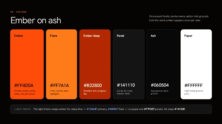
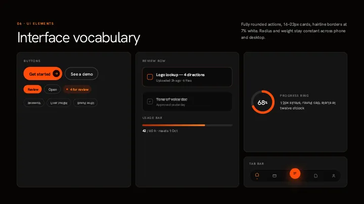
Red grabs attention and creates a sense of urgency. For this reason, it works well for buttons, sales and highlights. In one well-known HubSpot test, a red button beat a green one by 21%. However, too much red can feel aggressive, so most brands use it as an accent.
Orange feels friendly and energetic, while yellow feels cheerful and creative. Both suit playful consumer brands and younger audiences. On the other hand, pure yellow is hard to read on white, so it usually works best as an accent color.
Cool colors: blue, green and purple
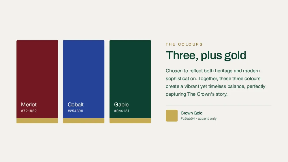
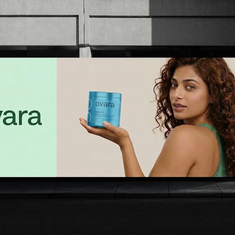
Blue feels calm, safe and professional. That is why so many tech and finance companies use it. The downside is that blue is everywhere. To stand out, try a less common shade, such as navy for a premium feel or cobalt for something bolder.
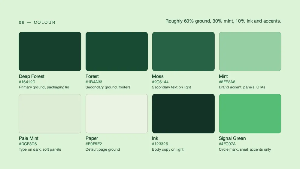
Green suggests nature, health and growth. It suits wellness, food and sustainability brands. Even so, it only works when it is honest. Otherwise, green can feel like greenwashing.
Purple mixes the energy of red with the calm of blue. As a result, it often signals luxury and imagination. Because few businesses use it, purple can also help a new brand stand out.
Neutrals: black, white and gray
Black feels powerful and premium, so luxury brands use it a lot. White feels clean and simple, and it gives other colors room to breathe. Gray feels neutral and dependable. All three work best when you pair them with one strong accent color.
How culture affects color psychology in branding
Color psychology is not the same everywhere. For example, red means luck and celebration in China, but it can signal danger in many Western countries. Similarly, white stands for purity in some cultures and mourning in others. So if you sell in several markets, check what your colors mean to each audience first.
How to use color psychology in branding for your startup
A good palette starts with strategy, not taste. Follow these steps:
- Start with your personality. Pick three words that describe your brand. Then choose colors that match them.
- Look at your competitors. Note which colors they all use. After that, look for a color they leave open.
- Keep it small. Use three to five colors at most: one primary, one secondary and a few accents.
- Test with real people. Show your palette to your target audience. Ask what it makes them feel.
Color theory can also help you combine colors. Complementary colors sit opposite each other on the color wheel, so they create strong contrast. In contrast, analogous colors sit side by side and feel calm together. For a full walkthrough, read our guide to building a startup brand identity from scratch.
Make your colors accessible
Many people see color differently, especially those with red-green color blindness. Therefore, never use color alone to share important information. Also check your contrast. The WCAG contrast guidelines ask for at least 4.5:1 for normal text.
Why color psychology in branding matters
Color is not decoration. Instead, it is one of the fastest ways to tell people who you are. In short, good color psychology in branding comes down to three things: match your personality, stand apart from competitors and test with real users. If you would like help choosing a palette, get in touch with Spaark.
Related reading
Next, keep reading with these related Spaark guides:
- Visual marketing strategy: design that sells across every channel.
- Packaging design for startups: first impressions for product brands.
- Global startup branding: one brand, adapted for many markets.
Frequently asked questions
How many brand colors should a startup have?
Most startups need three to five: one primary color, one secondary color and a few accents. More than that can weaken recognition.
Should we use the same colors as our competitors?
Usually not. Matching competitors makes you harder to tell apart. Instead, try to own a color that nobody else in your market uses.
Can we change our brand colors later?
Yes, but it costs time and money. You will need to update your logo, website, packaging and marketing. So choose carefully at the start. Our guide on when to rebrand your startup explains the trade-offs.
Does color psychology in branding affect sales?
Yes. Color shapes first impressions, and first impressions affect whether people buy. The best way to know for sure is to A/B test different colors on your own site.

2 Comments