Your logo is your startup’s most visible design asset. For example, it appears on your website, social media, business cards and packaging. Good startup logo design creates a simple, memorable symbol that people link to your brand.
This guide explains what a logo needs to do, the main types and how to get it right the first time.
What startup logo design needs to achieve
A good logo has a few clear jobs. It should:
- represent your brand at a glance
- work at every size, from a tiny app icon to a billboard
- still work in one color
- be easy to remember
- look different from your competitors
In other words, if a logo loses its detail when it gets small, or falls apart in black and white, it isn’t ready yet.
The main types of logo
Overall, there are four common types. First, a wordmark uses only your name, like Google. Second, a symbol uses an icon, like Apple. Third, a combination mark pairs both, like Mastercard. Finally, an emblem places text inside a shape, like Harley-Davidson. Then choose the type that suits your name, your audience and where the logo will appear.
The startup logo design process
A good process starts with a brief. What does your brand stand for? Who is your audience? What feeling should the logo give? Next, the designer explores many rough ideas. Then a few strong options are refined and tested with real people. Our guide to writing a design brief can help you prepare.
Try to avoid design by committee, though. When too many people give opinions, the result often loses its edge.
Common startup logo design mistakes
Watch out for these common problems:
- trendy fonts that date quickly
- too much detail
- copying what competitors do
- gradients that break at small sizes
- clip art and tired clichés
Professional designer or DIY?
Admittedly, logo tools and templates are quick and cheap. However, many people use the same templates, so the results often look alike. By contrast, a professional designer creates something unique to you. In the long run, that usually costs less than redoing a weak logo later.
Let your startup logo design evolve
Famous logos rarely change completely. Instead, they evolve. For example, Apple dropped its rainbow stripes but kept the apple. In the same way, small refinements keep a logo fresh without losing the recognition you have built.
Protect your logo with a trademark
Once you have a logo, make sure you protect it. Above all, registering a trademark stops others from copying it. In South Africa, trademarks are registered through the CIPC, while WIPO explains how to protect a mark in other countries. It is worth speaking to an intellectual property lawyer as well.
Create logo usage rules
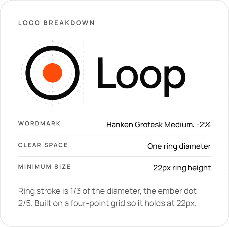
Finally, write simple rules for using your logo. Cover the minimum size, clear space, color versions, approved backgrounds and what never to do. As a result, these rules keep your logo consistent as more people use it.
Conclusion: invest in startup logo design early
In short, startup logo design is worth getting right from the start. A strong logo builds recognition and trust, while a rushed one is costly to replace. To see how a logo fits into the bigger picture, read about building a startup brand identity and why startups need professional branding. Or ask Spaark to design yours.
Related reading
Next, keep reading with these related Spaark guides:
- Color psychology in branding: what your colors say about you.
- When to rebrand a startup: the signs, timing and rollout plan.
- Global startup branding: one brand, adapted for many markets.
Frequently asked questions
How long does professional startup logo design take?
Usually four to eight weeks, including discovery, concepts, refinement and final files.
Which file formats should I get?
At minimum, ask for SVG, PNG, PDF and EPS files, in full color, black, white and reversed versions.
What is the difference between a logo and a brand?
A logo is a symbol. A brand is the whole experience people have with your company, including your voice, colors and service.
When should we update our logo?
Only when your business changes in a big way, such as a new market or audience. Don’t change it just to follow a trend.

3 Comments