
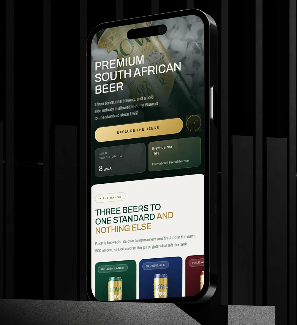
Most people now visit websites on their phones. Even so, many startups still design for desktop first and squeeze the site onto mobile later. Mobile-first web design flips that process. You design for the small screen first, then add more for larger screens.
This approach forces clarity, keeps pages fast and gives phone users a better experience. Here is how to do it well.
Why mobile-first web design matters
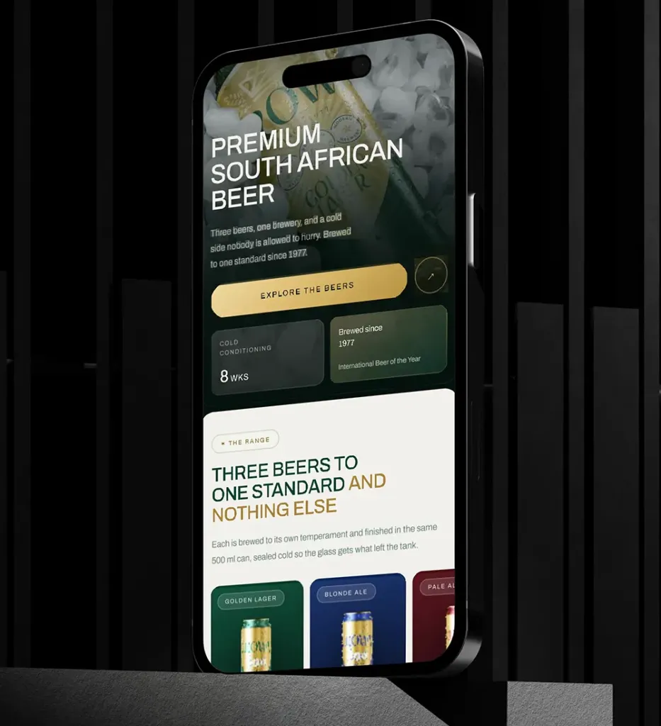
There are three big reasons. First, Google mainly uses the mobile version of your site for ranking, as its guide to mobile-first indexing explains. Second, phone users are impatient, so slow or cluttered pages lose them fast. Third, designing for a small screen makes you cut anything that isn’t essential. As a result, your desktop site gets clearer too.
Mobile-first navigation
Big desktop menus don’t fit on a phone. Instead, keep your main menu to around three to five items. Make every tap target at least 44 to 48 pixels, so thumbs can hit them easily. Also avoid deep, nested menus, because people rarely dig through them.
Readable type on small screens
Text needs to be easy to read on any screen. For body text, use at least 16 pixels and generous line spacing. Headlines can shrink on mobile, but they should stay bold and clear. Keep paragraphs short, too, since people skim on their phones.
Touch-friendly design
Hover effects don’t exist on touch screens. Therefore, every button needs to look clickable without them. Give clear feedback when someone taps, and place key buttons where thumbs can reach them. Simple swipes work well; complex gestures usually frustrate people.
Fast images in mobile-first web design
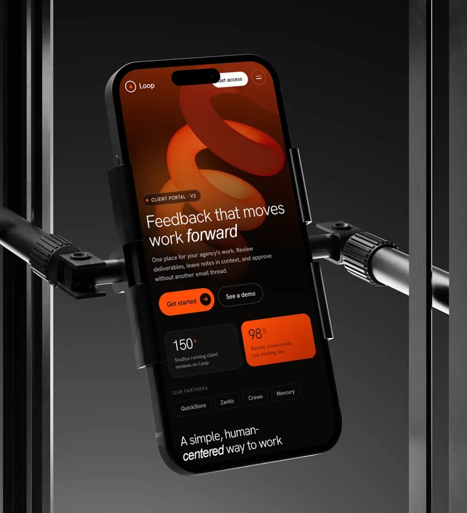
Large images slow phones down. To fix this, use modern formats like WebP, load images only when they come into view and serve smaller files to smaller screens. Also add alt text to every image, so everyone can understand it.
Speed and performance
Mobile networks are often slower than home Wi-Fi. That is why every kilobyte counts. Shrink your code, delay scripts that aren’t needed straight away and use caching. Then test your site on a real phone with a normal mobile connection, not just on fast office Wi-Fi.
Build up, not down
Start with a simple version that works for everyone. After that, add extra features for devices that can handle them. This way, your site still works even if a script fails to load.
Set the viewport
Your pages need a viewport meta tag. It tells phones to show the page at the device’s real width. Without it, the page appears zoomed out and is hard to read. MDN’s viewport guide shows the exact code.
Test mobile-first web design on real devices
Browser tools are useful, but real phones show the truth. So test on both iPhone and Android, on real networks. You will spot problems that a simulator misses.
Conclusion: mobile-first web design is the default
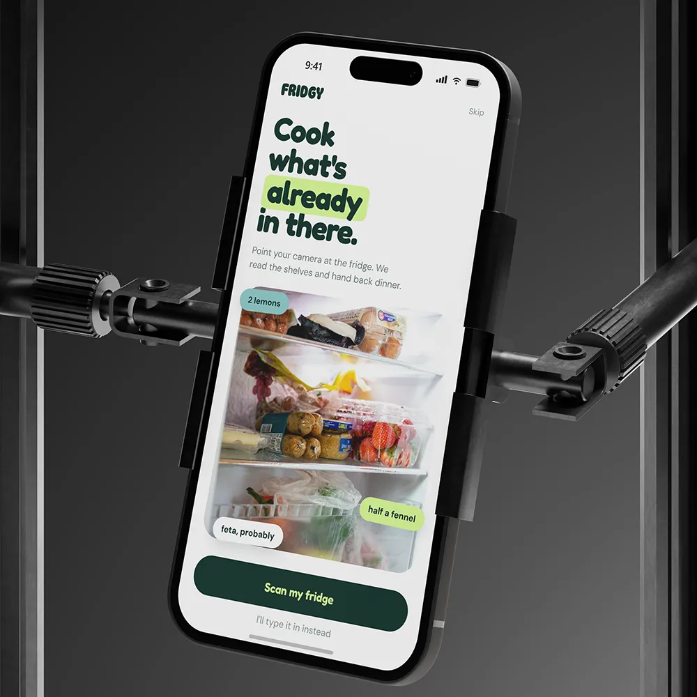
In short, mobile-first web design is no longer a trend. It is simply how good websites are built today. When your phone experience is excellent, your desktop site improves as well. To go further, read about web design that converts and web design trends 2026, or ask Spaark to review your site on mobile.
Related reading
Next, keep reading with these related Spaark guides:
- Design systems for startups: keep your product consistent as you grow.
- The real cost of DIY web design: the hidden price of building your own site.
- How to write a design brief: seven steps and a free template.
Frequently asked questions
What is the difference between responsive and mobile-first web design?
Responsive design makes a desktop layout shrink to fit a phone. Mobile-first starts with the phone and then expands. Mobile-first usually gives better results.
Should we build separate mobile and desktop sites?
No. One responsive site is easier to maintain and better for SEO.
Should we disable zoom on mobile?
Never. People need to zoom for accessibility, so always allow it.
Does mobile-first hurt the desktop experience?
No. In fact, the focus it forces usually makes the desktop site clearer as well.


1 Comment