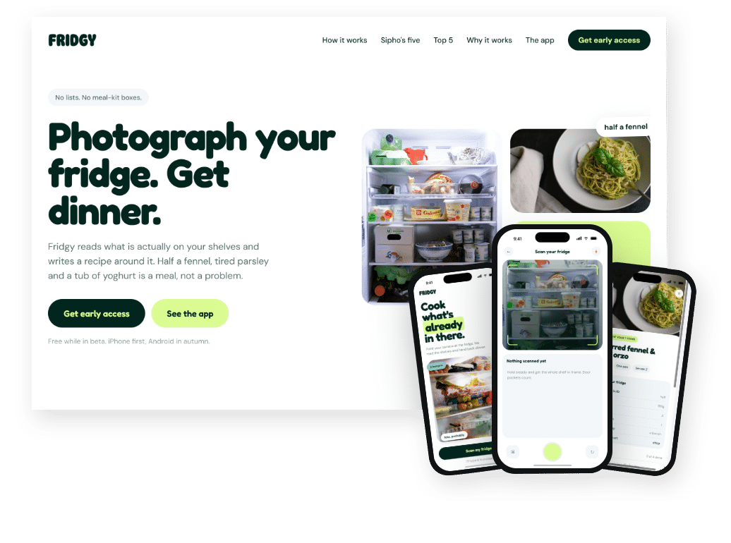
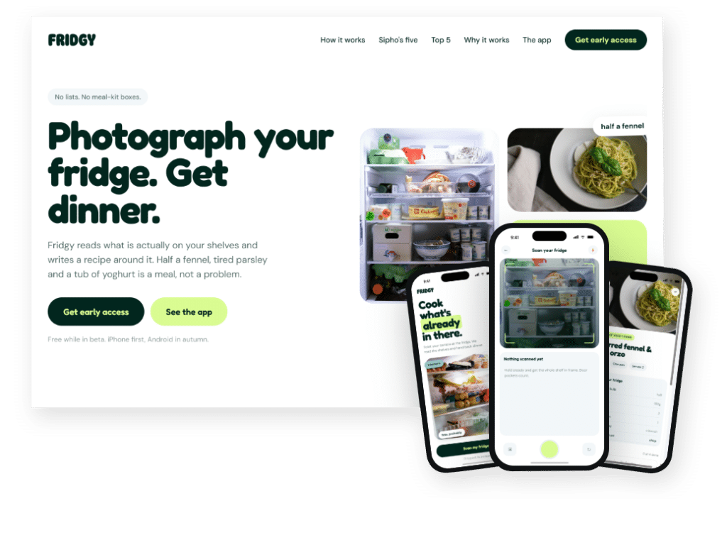
A beautiful website means little if visitors leave without acting. Web design that converts combines good looks with clear strategy. Every part of the page, from the headline to the buttons, guides people toward one action, such as signing up or buying.
This guide covers ten principles you can use on your startup site today.
Clarity: the base of web design that converts
Visitors should understand what you offer within a few seconds. So your headline needs to answer three questions: what you do, who it’s for and why it matters. In short, clear words beat clever ones every time.
Visual hierarchy
Next, guide people’s eyes on purpose. Use size, color, contrast and white space to show what matters most. Research by Nielsen Norman Group on how people scan web pages shows that visitors skim, so put key points where they will see them.
Strong calls to action
Your buttons drive results. Therefore, make them stand out with a contrasting color and plenty of space. Use action words, too. For example, “Start my free trial” usually works better than “Learn more”.
Short, simple forms
Long forms put people off. For this reason, ask only for what you really need. Also label each field clearly and show helpful error messages. If a form must be long, split it into short steps.
Social proof
After all, people trust other people. So show reviews, case studies, client logos or user numbers. Specific results work best. For instance, “cut review time in half” is more convincing than “great service”.
Honest urgency
Limited offers and deadlines can encourage people to act. However, only use them when they are real. Fake urgency damages trust quickly.
Mobile-friendly web design that converts
Many of your visitors will arrive on a phone. That means simple layouts, large buttons and very little typing. For more detail, read our guide to mobile-first web design.
Fast load times
Slow pages lose visitors. To speed things up, compress images, remove unused scripts and use caching. As a bonus, faster pages also tend to rank better in search.
Web design that converts is tested, not guessed
Small changes can make a big difference. So test one thing at a time, such as a headline, a button or an image. Then keep what works. Just be patient and let each test run long enough to give a clear answer.
Capture emails
Not everyone will buy on their first visit. Because of this, offer something useful, such as a guide or a discount, in return for an email address. You can then follow up over time.
Conclusion: web design that converts removes friction
In the end, web design that converts isn’t about tricks. Instead, it is about removing friction, building trust and making the next step obvious. Test often and improve step by step. For more, see our guides to UX design for startups and the real cost of DIY web design, or ask Spaark to review your site.
Related reading beyond web design that converts
Next, keep reading with these related Spaark guides:
- Web design trends 2026: ten shifts every startup site should know.
- Visual marketing strategy: design that sells across every channel.
- Packaging design for startups: first impressions for product brands.
Frequently asked questions
What is a good conversion rate for a startup site?
It varies by industry and traffic source. Rather than chasing an average, track your own rate and work to improve it month by month.
Does button color matter in web design that converts?
Contrast matters more than any single color. Your button should stand out clearly from the rest of the page.
How many fields should a sign-up form have?
As few as possible. Start with three to five and only add more if you truly use the data.
Should we use pop-ups?
They can work if they offer real value and appear at the right time. Otherwise, they annoy visitors.
2 Comments