
Brand identity

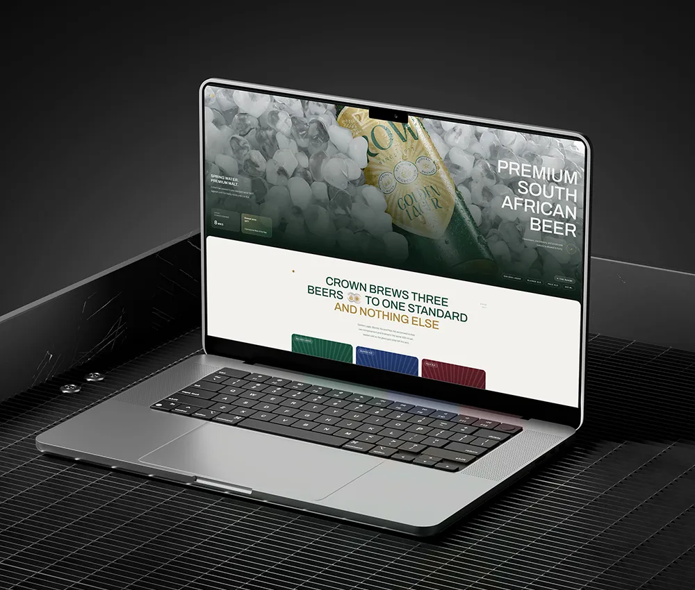
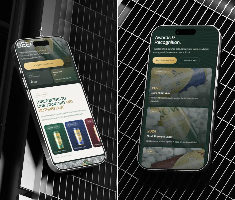
Crown came to us with fifty years of equity in one mark and nowhere modern to put it. We wrote the identity, designed the website in desktop and mobile, supported the packaging and built the launch set, all off the original 1977 crest.
We worked with a South African brewery to turn a heritage label into a system that can run as smoothly as its brewing operation.
The work:
Brand identity, Guidelines, Web design, Packaging, Launch campaign
The impact areas:
Brewing, FMCG, Heritage brands
By the numbers
What went into the Crown Brand.
0
Quality seals carried over
0
Products in range
0
weeks to develop
0
page brand ci document
0
page responsive website
0
Sociale media templates
the range
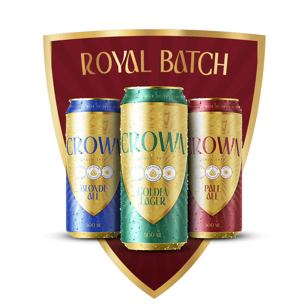
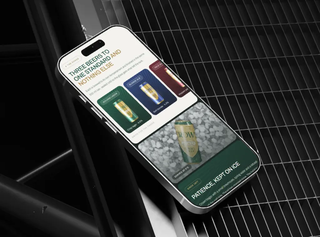
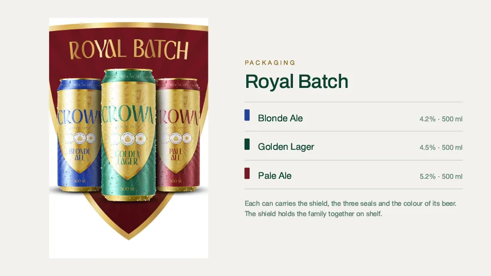
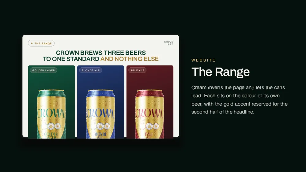
3 brews, one complete range
02
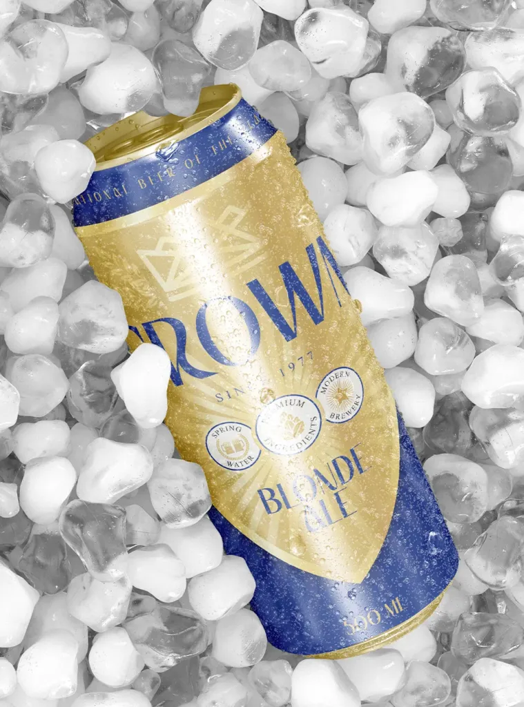
Blonde Ale
Cobalt takes the can. Same shield, same three seals, so it reads as family on shelf.
01
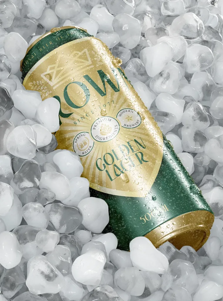
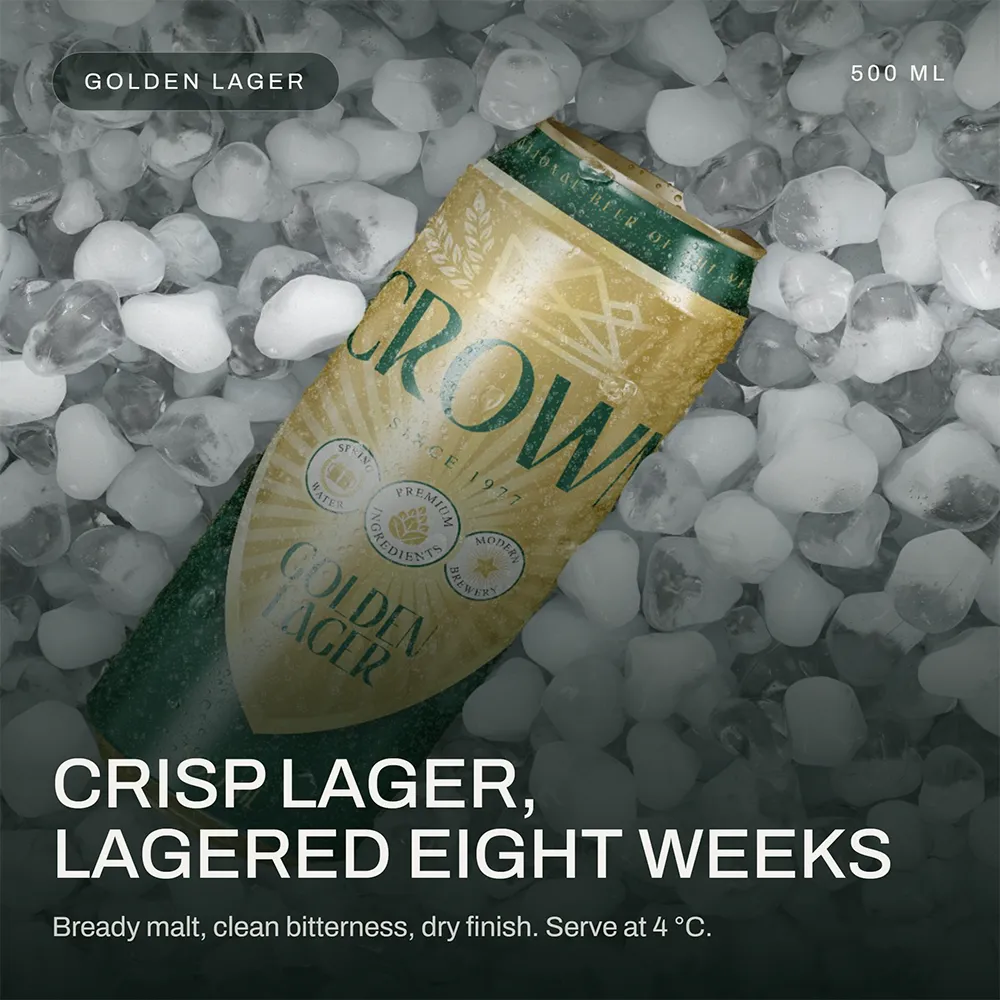
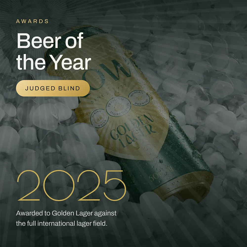
Golden Lager
The original, and the one the crest was drawn for. Gable green carries it across pack, site and feed.
03
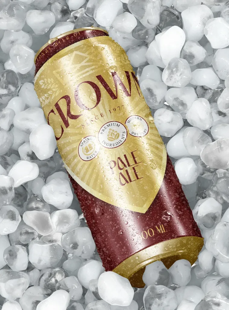
Pale Ale
Merlot closes the set. A fourth beer can join on one new colour field without a redraw.
Discover the Crown system
Built to hold together
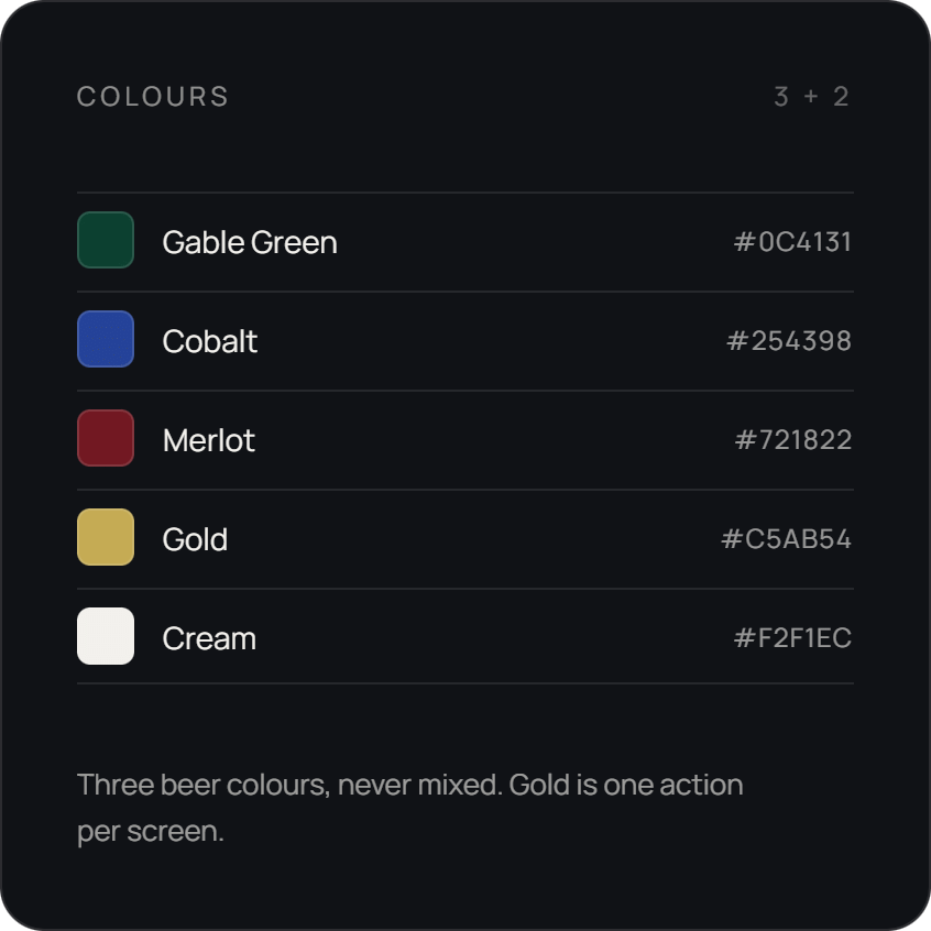
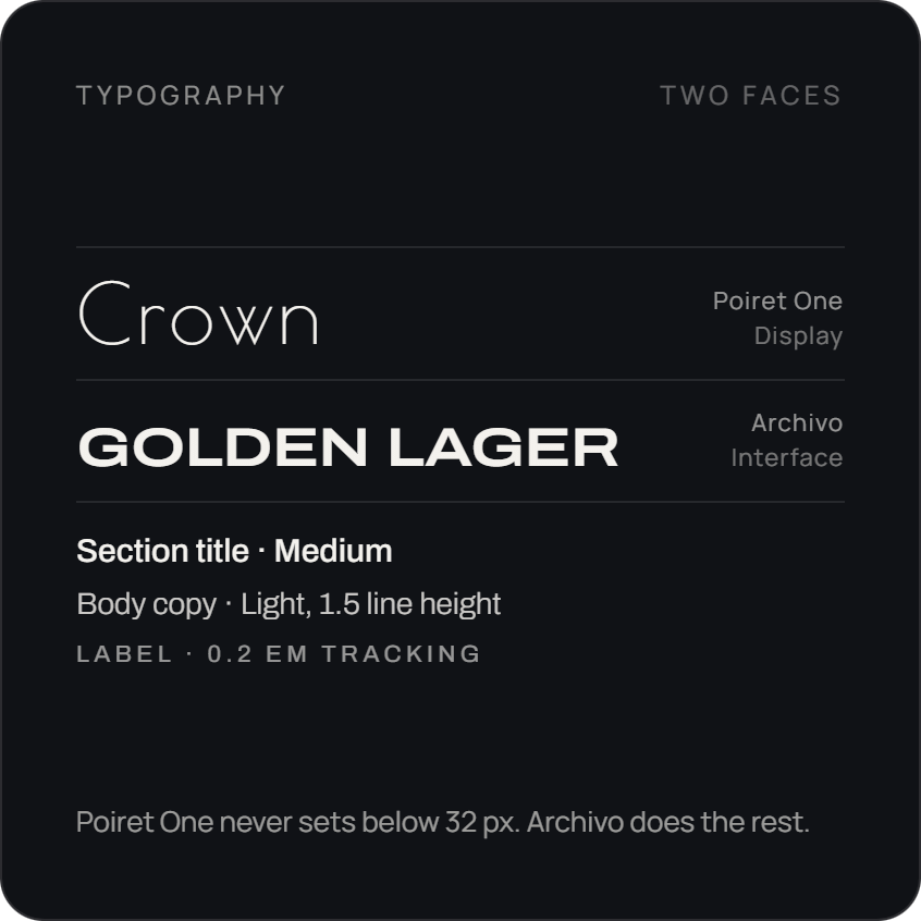
The website to complement
New users arrive before they trust an AI with their dinner, so the page leads with the mechanic rather than the pitch: three steps, a photo of a real scan, the community top five and the resident cook’s picks, all above the signup.
0
Pages
0
step system
0
product focus
The brand book
Twenty slides of house rules
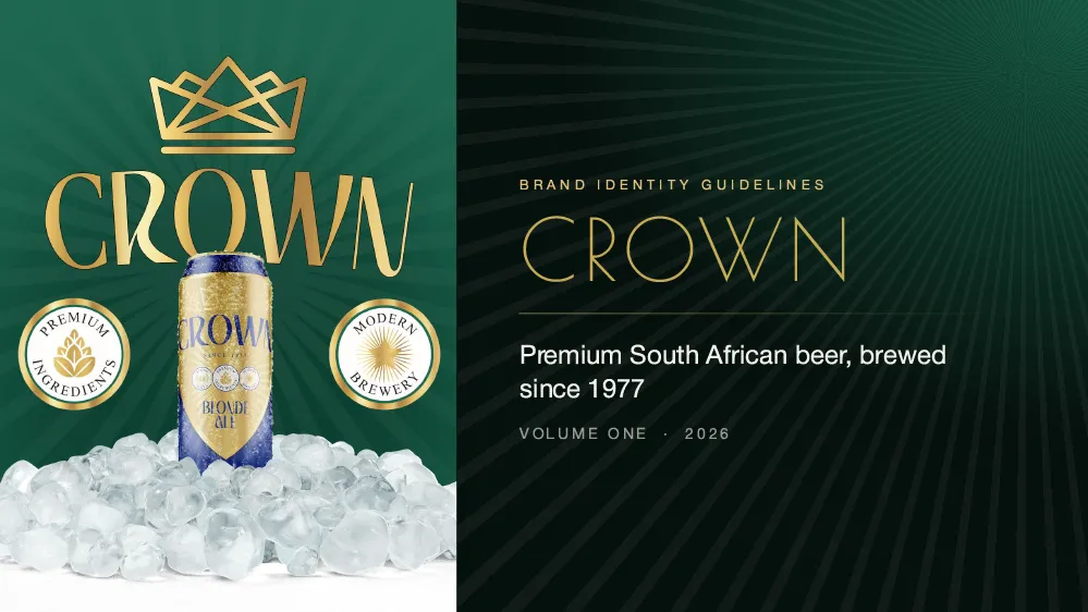
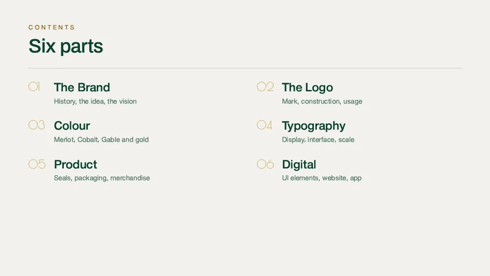
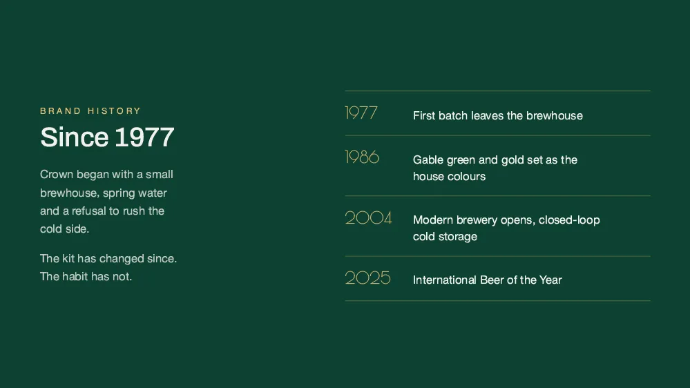
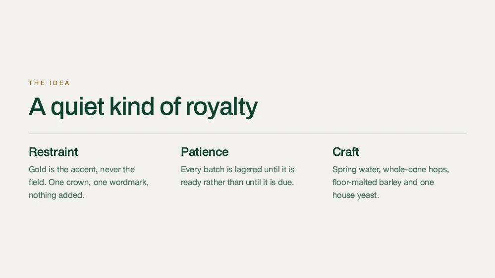
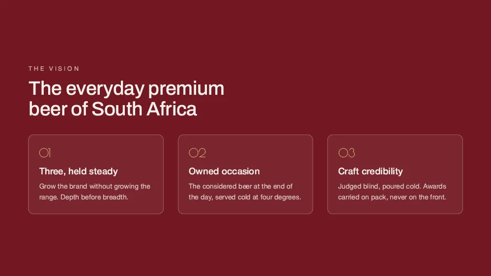
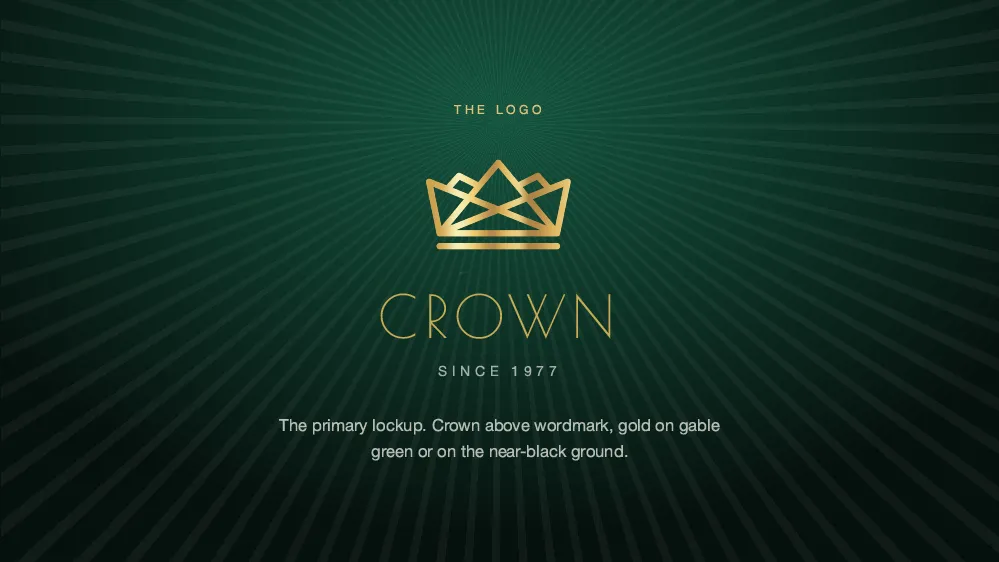
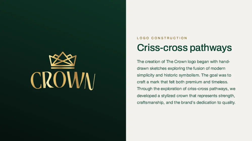
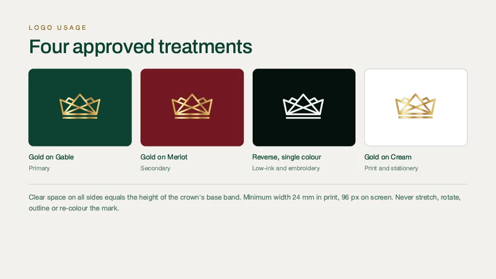
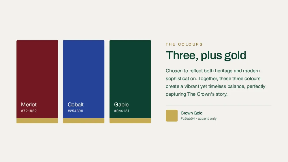
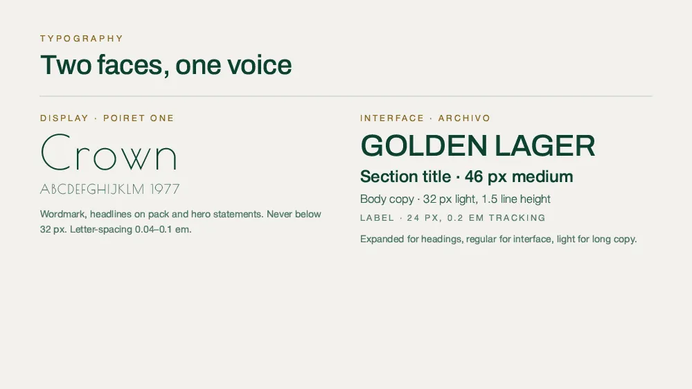
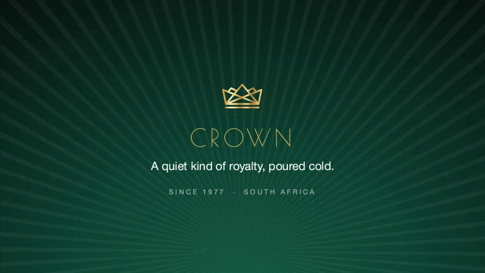
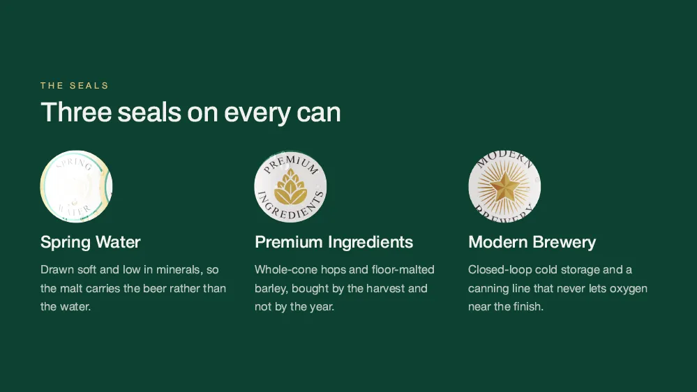
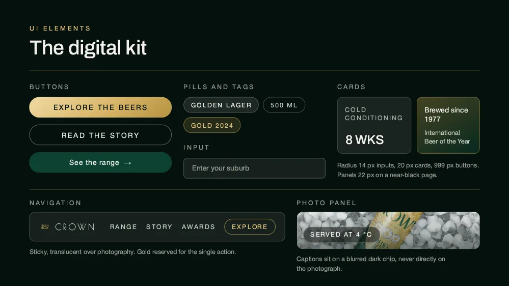
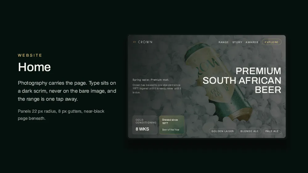
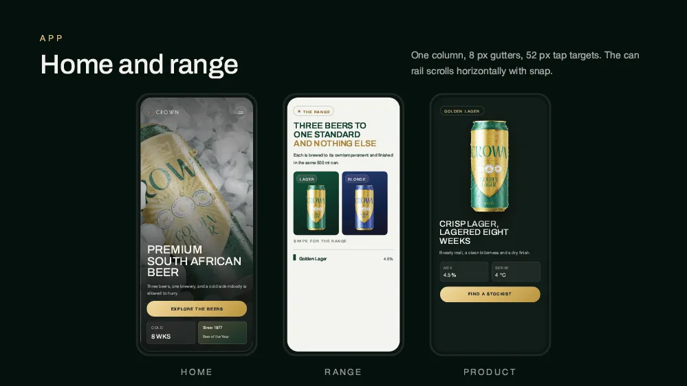
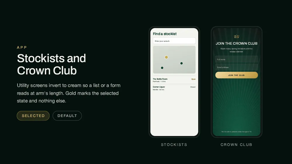
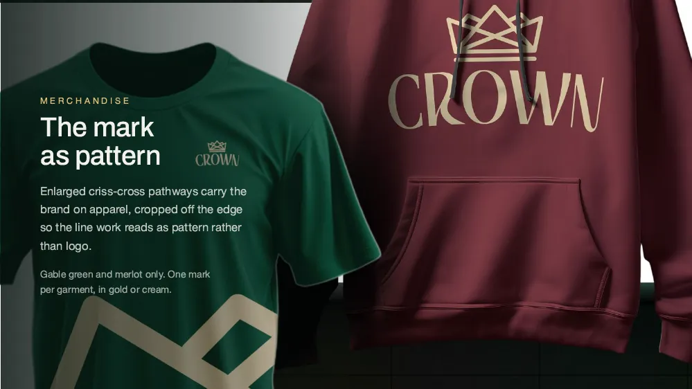
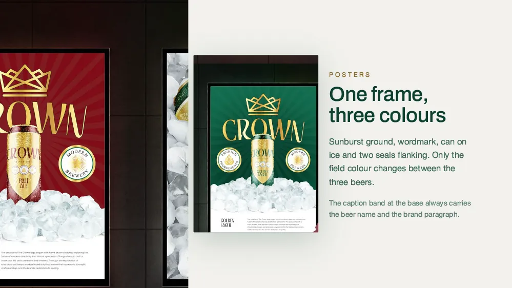
We had fifty years of the mark and no rules for it. Spaark wrote the rules without changing a thing on the shelf.
Johan Bekker
Managing Director, Crown Brewing Co.
The guidelines settled arguments we had been having for years. New artwork now takes days instead of weeks.
Lerato Mahlangu
Marketing Lead, Crown Brewing Co.